This interview is a bit self-serving. Luke Spooner has been the cover artist and illustrator for a wide range of projects of which I have been a part. A lot of those will be used as examples through the interview. Most recently, he signed on to be the cover artist and illustrator for The Dead Song Legend Dodecology which includes his cover and five interior illustrations and The Sound May Suffer – Songs from the Dead Song Legend Book 1: January. He’s an interesting character and is well utilized by the indie genre book publishers for his unique talent.
This is the cover wraparound spread for The Dead Song Legend Book 1: January from Milwaukee to Muscle Shoals.
Jay Wilburn, Author of The Dead Song Legend Books: How early in your life did you connect to art? When did that become a serious passion for you?
Luke Spooner, the man, the artist, the legend: You hear a lot of stories from established artists and professional creatives about their ‘eureka moments,’ that moment when the clouds parted, their soul did a back-flip and they were speared down the path of their passion; lifted out of a life completely void of meaning and plopped into something more soul nourishing. I wish I had my own version of that story to hand, a story I could whip out at a moment’s notice but the truth is; it just never happened. I know an admission of that type sounds like it’s going to be followed by a long tale of negativity and envy, but I’ve never been lifted out of some sort of haze and shown where I should have been the whole time.
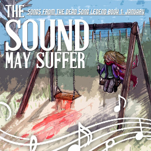
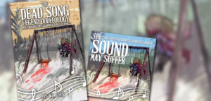
This is the cover that Spooner did for The Sound May Suffer – Songs from The Dead Song Legend Book 1: January.
I was doodling from the moment I discovered pencils and things to scribble on. In those early formative years it was just a way of emulating what I loved; I used to draw my favourite characters from television shows, books – even imaginary characters that I’d make up and try to explain to others and write stories about. In hindsight; the desire to communicate ideas through visual means actually developed earlier than my attempts at communicating through spoken language. I’m not saying I was any good at it – I’m just saying it was my first port of call once I realized there were things I needed to get out of my head, but gradually, over time, it became a tap – a leaky faucet that you really had to put your back into if you were to have any hope of turning off. Even then it would still drip. Aside from the occasional reprimand when I drew on walls, radiators or grandparents – It never occurred to me that some people just didn’t do it. It seemed so important and instinctive, but as with most things in life; once you arrive at school and find peers of your own age staring back at you, you notice people and they notice you, the things that separate you from them start to become clearer and clearer. I noticed them staring at me and my collection of pencils and fine line pens in varying grades, colours, tones and styles with expressions of confusion as opposed to understanding and that’s when I started to realize that maybe it wasn’t something everybody had to do – or even wanted to do.
Jay: What do you recall about the transition from studying art to pursuing art as a profession?
Luke: When I reached the age of 18, I had gathered enough understanding of the world to know that there was a chance I could do something creative, something that involved creating images to convey meaning, for a living – a way of making money to allow me to create images for as long as possible with no interruptions. It was suggested by my art teacher, one of the greatest artists I’ve ever known, that I undertake a Foundation Degree at the Wimbledon College of Art in London. Following this suggestion up and applying myself to getting accepted was a confirmation that I was indeed going to do something creative as a profession; I’d sat across tables from other students with artistic prowess far greater than my own for years by this point and despite this I still felt very strongly that I could find a niche for myself that they couldn’t fit into. That degree, in total, lasted a year and was essentially, what became known in retrospect, as an ‘options year,’ a term suitably vague and confusing. I spent the first couple of weeks sampling everything the establishment had to offer but I was soon told, along with the wide eyed student body, to whittle it down to my three areas of interest which we would then study for another month or so. Once we’d had a very concentrated taste of each of the three we selected our preferred subject and committed ourselves to studying it until the end of the year. I ended up in a scary umbrella option called ‘visual communication,’ which basically meant commercial imagery in the broadest and (sadly) vaguest sense. I was trapped in a room, right on the edge of Wimbledon like a dirty secret, shoulder to shoulder with photographers, graphic designers, typographers, traditional illustrators, children’s book illustrators and even a couple of fine artists who had severely lost their way, but decided that it couldn’t have possibly been there fault. I barely made it out of that year purely through the department’s constant need to try and cover every discipline’s needs on a daily basis. We were essentially a broth with too many chefs and I lost any sort of direction or idea of what I truly wanted to be. However, I did survive it and based on the few tethers I’d managed to grasp over the course of a year under the degree’s instruction I decided to sign up to The University of Portsmouth’s illustration degree.
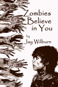
This is artwork he did for the cover of a collection of zombie novellas titled Zombies Believe in You.
When I got to Portsmouth everything was confirmed. I was reminded of what I truly enjoyed and what I wanted to do more of in the future. The degree provided the perfect platform for me to start from and presented the bare bones truth of what the world I was trying to install myself into was and would be like, so any second thoughts I would have had were put aside fairly early on. The unofficial mantra that got passed down by the lecturers, and made frequent appearances in our group tutorials like a support meetings code of conduct was “what you put in – you will get out,” and while that obviously sounds like common sense, I can assure you that you’d be amazed at how many people decided to sit back, put in minimum effort and just assume the work would find them both during University and out in the big, wide world of work. I heard from one of my friends at a London based art degree while I was Portsmouth that her department’s stock phrase was “nobody wants you,” which although incredibly depressing is an unfortunate truth.
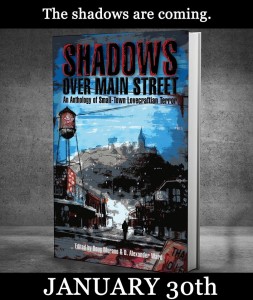
This is his cover art for Shadows Over Mainstreet, an anthology of Lovecraftian horror set in small town settings.
When I left University in 2012 I had finished my illustration degree; handed in work, filled 14 sketchbooks, written a dissertation on film noir, even wall mounted my work for an exhibition to be looked over by a horde of complete strangers all over the course of the final third year. The deadline was very specific and had all sorts of scary words attached to it by the lecturers which had surfaced with increasing frequency over the weeks leading up to this moment. There was a very real sense, a pulse, of palpable tension running throughout the illustration department’s student body like wildfire and it manifested itself in many ways. For me, personally, it meant some very early mornings coupled with some very late nights but regardless of how individuals reacted and prepared; the deadline in May was our collective focus as students on the cusp of being professional illustrators and designers. What we didn’t realize was that we didn’t officially graduate until the July of that year. This meant that we effectively had two whole months of not having a clue who we were supposed to be; were we students? Were we graduates? Could we start working without knowing whether we’d passed? The list of open ended questions goes on and on but when you’re talking about a department full of potential freelancers you knew you weren’t going to get any answers – even the lecturers gave the impression that they now saw you as competition as opposed to the subordinates they were teaching a week previous.
There was absolutely no hope of turning to your fellow artists and finding out what they had planned because competition was verging on blood thirsty, so rather than dwelling on it, I decided that I didn’t need to know what grade I got – or even whether I’d passed to be a practicing freelancer. I had a portfolio to my name and a desire to work and seek out potential projects so for two months I emailed and searched, rinsed and repeated, sending upwards of 40 emails a day until eventually one client, just as fresh and new to ‘the game’ as I was, said they wanted me on board for their new project and were willing to pay me actual money in return for my services. The client in question was Grim Corps and although they’ve since gone on an indefinite hiatus due to personal reasons and my work for them is over 3 years old now – they still sit very high up on my list of clients over at www.carrionhouse.com and should do for many years to come.
This is the cover Spooner did for Horrific History, an anthology of alternate history horror stories.
Jay: Your work has been utilized a great deal with indie genre book covers. Did you originally anticipate this as being an outlet for your art? How did that develop?
Luke: I never had any idea of the actual form my work would take until it started getting requested. I let the clients that approached me decide that for me. All I had were pictures on a web site, clients were the ones that decided it’d be appropriate for the front of books and magazines. As mentioned previously; I had faith that my work would simply find its’ niche as long as I put effort into everything I did and kept pushing myself artistically. It’d hopefully be like snow falling; it’d pile up somewhere – I just have to keep it falling. Eventually I did notice an ‘indie’ trend developing as well as a trend in the genre’s that my work started to appear in; horror, fantasy, science fiction etc. and I decided to feed off those genres, find out what really does fit and see if I could use my knowledge of them to inform and evolve my work to better suit and hopefully in turn develop further business.
Jay: How do you decide on what projects to take on? What goes into that decision?
Luke: That is an incredibly difficult thing to unpick and lay bare. I very rarely turn a professional project down as I see all projects as opportunities to forward myself artistically which has always been and will always be my goal overall. I do however refuse projects that compromise illustration as a profession. A select few people have approached me in the past with the belief that I’m an artist in my spare time as opposed to professionally, that it’s something that is simply tacked on to the rest of my life as an after thought or hobby. These people also have a tendency to ask for work that goes far beyond the normal requests of professional clients and then offer zero compensation for my efforts as they believe that creative people accept projects purely for the ‘warm fuzzy’ feeling it gives us deep down. Illustration is a profession and deserves to be treated as such, any work done for free undermines you as an artist and those working in your field.
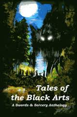
This is the cover Spooner did for a fantasy anthology, Tales of the Black Arts.
Jay: I can usually identify a Luke Spooner cover or artwork when I see one. What do you think makes your work distinctive? What is it about your style that is unique to you?
Luke: I genuinely don’t know and I think that’s because I spend so much time with each piece before it even gets shown to a client. People will see a cover and they’ll see the image as it is, finished, but I look at the end product when it comes through in the mail and I see a book that has my sketch on it, my paint, my mistakes, my sneaky cover ups, the moment I accidentally spilt tea on it and decided it still worked, the lines and finishing touches that I was really unhappy about but took ten minutes away from and came back later only to find that they weren’t so terrible after all. It links back to the connection I made to the creation of visual imagery and the development of language in that it’s like you’re handwriting; you don’t know why it looks the way it does, or why it isn’t like other peoples’ but when you put your pen to the paper it comes out every time without fail and it’s yours. The minute you start questioning it and trying to change it gets all wobbly and weird.
Jay: How strongly do you advocate for a particular look or theme with the art that you create? Are there ideas that you push for in your work or do you tend to leave that on the clients to decide?
Luke: I quite often have to remind myself that the customer is always right, not because I believe they are wrong but because I know that if it was up to me then I’d be incredibly self indulgent and create a piece that would make me incredibly happy but not necessarily be what the client is after. Illustration is and always will be a collaboration with multiple participants; the illustrator, the author, the publisher, the illustration brief, the aesthetic, the text, the background and source material etc. and it’s a list that grows and shrinks from project to project. If I think a piece’s composition could be improved then I will act in a way that allows me to communicate that to the client, but if the client disagrees, then I have to remind myself that my style of illustration is what they approached me for and that I am a surrogate parent for an idea that they can’t physically create themselves. If I believe really strongly in my idea then I will perhaps make my suggestion in a different way as sometimes, especially through email and the sending of digital images, a lot can get lost in translation, but at the end of the day the customer is always right and any belief that you can overrule them because you’re the one holding the paint brush is childish.
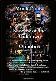
This cover appears on the Monk Punk and Shadows of the Unknown Omnibus of anthologies by Aaron French.
Jay: You did the covers and interior art for the Dead Song Legend Book 1 and the soundtrack The Sound May Suffer. Describe your process for completing those pieces.
Luke: I read through the story as it became available as I would with any project. I had a notebook in which I jotted down key events, character descriptions, locations, colours and ideas as they happened, chapter by chapter. What set this project apart from those before it was that at the same time I had to keep the music that’s mentioned and explored throughout the narrative at the forefront of my mind and be open to it informing the imagery and ideas that I was composing in my mind as I read. I’ve never had a client approach me for both a book and a soundtrack that have to be composed in tandem to each other. I’ve created album artwork for bands that has to be inspired by the music and I’ve even been asked for audio book artwork as a quick after thought on the client’s part as a book cover project comes to a close, but never anything like the Dead Song project.
How the images were composed was through a process of really trying to drag out the essence of each character. I don’t claim to fully understand them as that should be a claim that only the author can make, but it was very clear early on that this is not a ‘zombie epic’ as some may instantly assume from the title. The zombie element is very uniquely handled and looks set to go beyond a simple ‘outbreak’ but, in book one, it seems to take a temporary back seat and instead acts as a catalyst for the stories that take place and the relationships that develop between some of the most interesting characters I’ve been involved with in quite some time. It’s more of a speculation and study of how music could develop, evolve and alter if an event of this type occurred in our world today and how those closest to the music would do the same. Therefore, all of the illustrations for the interior are almost portrait style representations of the story’s characters. There are no dystopian landscapes devoid of life or overly grisly death scenes because that simply wouldn’t be a true representation of the story – the story is very much alive and it’s the characters that create that pulse therefore they are what fill the illustrations.
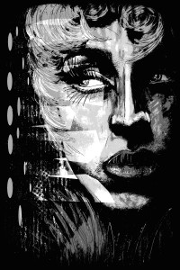
This is the first illustration found in chapter one of The Dead Song Legend Book 1: January from Milwaukee to Muscle Shoals. The character’s face is lit noir style from bullet in the back stage wall.
Jay: Interior illustration used to be common in books in previous decades, but then less so later. I’ve seen a few examples of it coming back. How common is interior illustration for books now and how does that differ from your work on covers?
Luke: Interior illustration is something that changes a lot depending on a client’s budget, it’s unfortunately the part that can very quickly raise the page count and in turn; overall cost of printing a book. That being said I do get a lot of requests for interior work, just as much as I do for covers in fact. I’m not sure whether I’m just lucky that way or that my style lends itself well to that medium, but it is safe to say that it can be a very different process to the one that comes with requests made for front cover art.
For a start, a cover is something that must represent an overall summary of the book’s content. This can be a blessing and a curse in equal measure as it can allow you to make something based on a vast amount of source material which can create some truly intricate, eye catching and impressive work. The other side of that coin is the very real notion that these types of pieces will determine the perception of someone’s entire body of work. The pressure and responsibility to create a great piece of work that accurately presents the book and caters to the client’s outlined requirements is quite frankly massive and you’ll often find that a client’s feedback is understandably more forcefully given and far more blunt should something not be to their liking.
Interior illustrations differ in that they represent, usually, one specific moment and cannot deviate far from that point. Artistic license is incredibly limited and the idea of a ‘general representation’ of the theme at play is non existent. The colours you can use are often limited too as the budget for interior illustrations often only reaches to black and white. Luckily my style of illustration, back in my school days, was forged in primarily black and white so it’s not so much a problem for me, but I can appreciate the difficulty other artists must face. An upside is that quite often you’ll just be asked for a single object, or a symbol or pattern that can illuminate a page and these are not only relatively easy, but also a pleasant break from my usual work which tends to be quite busy and intricate.
As for the future of interior illustration and it’s inclusion in cotemporary books – I have seen, and have the pleasure of being involved with, some truly innovative uses of it. One client in particular has started using book cover style illustrations as interior art to help introduce and separate the stories that appear in their anthologies. Titles and author credits are all included typographically just like a book cover, and the end result is something quite stunning and unlike anything else I’ve ever seen or worked on, so I think it’s definitely a medium that is evolving and becoming more of a feature as opposed to creeping back into the place it used to fill in the same way it always did.
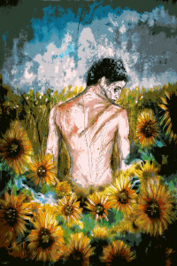
This is a color version of one of the interior illustrations in The Dead Song Legend Book 1: January from Milwaukee to Muscle Shoals.
Jay: You are involved in music yourself. What do you do as a musician? What influences your creativity in that way?
Luke: I’ve always connected to music, irrespective of genre, thanks to my parents and grandparents. None of them are outwardly musical, but they enjoy and like to share a huge range of music with me and my brothers. I picked up a guitar around the age of 17 because I saw one of my younger brothers playing one and found myself intrigued by the very sight of this person, who previously hadn’t shown any outward signs of being creative, mimicking songs we both loved and forging original pieces out of the knowledge he gained from those emulations. He was doing what I’d done as an infant, painting on anything and everything – just with a different type of brush.
Currently I am self taught and primarily play the guitar, I can also play acceptable bass and can hold some very amateur beats on the drums, but it’s only recently that I’ve found myself in a band style arrangement with two of my childhood friends. The idea of sharing a creative project is something I’ve always dreaded throughout my education and even now as a professional illustrator I shiver at the sight of ‘we’ll get a second opinion from this artist we know’ written in a client’s email. But the opportunity to explore a new side of my creativity, one that I have no formal education in, is something very exciting to me, very raw. As a band we explore our chosen instruments together, see how they gel with one another when put into the space of a composition and learn together from the end result. I’ve always allowed music to influence my illustration work and have a dangerously large CD collection to prove it, but being the one to create the music is a very new venture. I’m able to emulate the musicians I admire much like I would with artists I connect with and pick out the things I like about their work, but what makes it complete is that my band members can do the exact same thing. We have no biases as to what music we’re trying to make, we just ‘make’ and explore the result. It’s incredibly beneficial and, at least for me, uncharted.
Jay: In the art process for Dead Song, we talked a good bit about the symbols for Americana and what those mean to an audience. You expressed personal interest in those ideas and images. From your perspective, what is it that defines that idea and what is fascinating about the idea of Americana?
Luke: Americana is something that for me as a British citizen seems very alien. As a country, the USA is incredibly young in terms of history when you compare it to others currently occupying the globe. For that reason, I find it very interesting to see the qualities of a period in time that in the grand scheme of things was quite recent, resurface so quickly – and with such force. Fashion, trends in music, décor and design are all things that come back around time and time again as new people rediscover it but ‘Americana’ seems to reach all corners and become more of an aesthetic to someone’s life rather than something that they indulge in from time to time. I think the fact that the word ‘America’ is part of the name itself gives it a sense of exclusivity, but I also can’t think of a British equivalent. There’s something very endearing about the celebration of a culture and civilization so young and I think it’s admirable.
Jay: You put a lot of thought into the use of characters in art. The way they are positioned and contained within your art relates to their actions and position in the story. What role does storytelling play in your art?
Luke: It’s everything to my art; the desire to convey a message, or in some cases a narrative, through visual means is what sparks us all to pick up a pencil in the first place and years on it’s still what drives my work and sits at the heart of everything I do. Storytelling itself is the oldest and still the most tried and tested form of communicating an idea or belief to someone else. It’s gone off in many directions via religious texts, journalism, children’s books, fiction, blogs etc., but the idea has remained the same. Helping to translate other people’s narratives into something visual is a huge responsibility and I like to think that people approach me not just because the aesthetic of my work appeals to them, but also because they see me as a safe pair of hands for the world that they’ve created. I want their characters to be able to deliver the message they’ve been designed to carry because the world will ultimately be richer for it, even if it’s only by a minuscule amount.
Jay: Is there something different that goes into creating art for a long term series like what you are doing with Dead Song? How does that inform your work?
Luke: I knew there would have to be a ‘look,’ or ‘style’ to the way these cover played out. You have to take into account how the series will change from book to book, but still remain recognizable as being many parts of the same whole. You can play with colour changes, re-using the same characters, layouts, typographical placements etc., but you have to create something that can’t be mistaken for anything else. With something like this the potential, and temptation, to package it like something along the lines of ‘The Walking Dead’ is huge. They sell well, they’re recognizable from across a room or bookstore and chances are that fans of one will appreciate the other. However, if you go down that path, then you’re setting yourself and the project up for some very unfair comparisons. If we follow the thread of comparing this project to ‘The Walking Dead’ then similarities would end at the inclusion of zombies; the stories and themes explored aren’t completely parallel, the characters are fleshed out in a very different way and the overall tone of books are far removed from each other. Therefore, why compromise the integrity of one to sell like the other? The prime goal is to find that ‘look’ for the first book and soundtrack and then from there I plan to explore it and keep it true to itself and the story it packages.
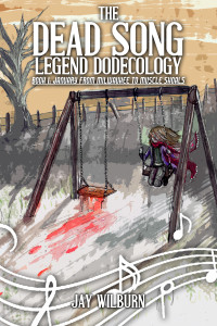
The Dead Song Legend Dodecology Book 1: January cover
Jay: In what ways do you connect with the horror genre? Is there something that speaks to you in that? Do you feel like you have been adopted/ drafted into the genre by horror and zombie writers that continue to utilize you?
Luke: I’ve always read, watched, drawn and connected with the horror genre. No matter what my pursuit; it’s always had that as a common theme. I have often wondered what keeps drawing me back to it and the answers come in waves when that particular flood gate is opened but if we focus on the writers themselves as a discussion point then I think it’s the honesty that horror draws out of people that I admire the most. That should sound very contradictory given that we’re talking about purveyors of fiction, but as an illustrator; someone who creates and fabricates images and worlds for a living, I can whole heartedly say that lying is far easier than telling the truth. Through their characters and stories, I’ve seen writers explore the darkest recesses of their selves, seen them lay bare dark and tender home truths, own up to secret fears and phobias, state and justify bizarre beliefs and ultimately be themselves even when their selves aren’t what they want them to be. The end result may be a fabrication, but the process that the writers have been through to get to that point is honesty distilled and purified to its’ very essence. On top of that they then give it to other people to read.
Jay: Is there a long term vision for you in terms of where you are going with your art or are you more connected into the moment when it comes to your creative process?
Luke: My long term vision has always been to just keep doing what I’m doing. There is no sort of grand scheme, despite having heard many students during my education state what age they wanted to be by the time they saw their work on the covers of certain magazines; I personally have had no idea of a deadline or ‘endgame’ when it comes to my art. The temptation has always been there, to attempt to put a date on when the achievement of something very specific and when it will be achieved, it’s something I’d like to be able to do. However the truth of the matter is that I tend to be so busy living from project to project that I very rarely get the chance to look backwards and see where I’ve been – let alone where I’m hoping to go. If I can do this, and nothing but this for the rest of my days then I’ll be happy and I’ll be me, that’s all I ever really want.
Jay: With the story in Dead Song Book 1, what if anything stuck with you as you read it from the standpoint of a visual artist?
Luke: I was amazed quite early on at how unnecessary I seemed to be as an illustrator. The story itself is written in a way that allows the entire thing to take place almost cinematically within the reader’s mind and upon initial acceptance of the project I assumed that the reason I was required was that, being a musically accompanied project, the visuals would somehow be lacking and required blostering. This was not the case at all and I actually found the prospect of bringing any of the characters within the book to life to be incredibly daunting. I wont know for sure how effectively I’ve managed this until the book starts reaching people who aren’t directly involved with it but as it stands I hope my work and it’s inclusion in the project stands as at least a fitting tribute to what I consider to be a incredibly important body of work.
Check out Luke Spooner’s work here. www.carrionhouse.com
The Dead Song Legend Dodecology Book 1: January from Milwaukee to Muscle Shoals is available now.
Jay Wilburn is the author of The Dead Song Legend Dodecology and the creator of the songs in The Sound May Suffer. He left teaching after sixteen years to pursue his dream of being a full-time writer. He lives with his wife and kids in Conway, South Carolina near the Atlantic coast of the southern United States. He is continuing forward with the dodecology and the music for each book as he desperately avoids all voices of reason.

![Pageflex Persona [document: PRS0000038_00063]](http://jaywilburn.com/wp-content/uploads/2015/04/Dead-Song-book-1-wraparound-example-300x219.jpg)
